── Attaching core tidyverse packages ──────────────────────── tidyverse 2.0.0 ──
✔ dplyr     1.1.4     ✔ readr     2.1.5
✔ forcats   1.0.0     ✔ stringr   1.5.1
✔ ggplot2   3.5.2     ✔ tibble    3.2.1
✔ lubridate 1.9.4     ✔ tidyr     1.3.1
✔ purrr     1.0.4
── Conflicts ────────────────────────────────────────── tidyverse_conflicts() ──
✖ dplyr::filter() masks stats::filter()
✖ dplyr::lag()    masks stats::lag()
ℹ Use the conflicted package (<http://conflicted.r-lib.org/>) to force all conflicts to become errors
df_cleaned <-read_csv("cleaned_data.csv")
New names:
Rows: 15786 Columns: 16
── Column specification
──────────────────────────────────────────────────────── Delimiter: "," chr
(10): incident_type, reported_month, region_of_origin, region_of_inciden... dbl
(6): ...1, incident_year, total_death_missing, number_of_females, numbe...
ℹ Use `spec()` to retrieve the full column specification for this data. ℹ
Specify the column types or set `show_col_types = FALSE` to quiet this message.
• `` -> `...1`
Q1 Which migration routes have become the deadliest?
# A tibble: 26 × 2
   migration_route                                       total_deaths
   <chr>                                                        <dbl>
 1 Central mediterranean                                        22862
 2 Unknown                                                      10749
 3 Sahara desert crossing                                        8251
 4 Us-mexico border crossing                                     5970
 5 Western africa / atlantic route to the canary islands         4957
 6 Western mediterranean                                         3454
 7 Eastern mediterranean                                         2380
 8 Horn of africa to yemen crossing                              1842
 9 Afghanistan to iran                                           1281
10 Caribbean to us                                                507
# ℹ 16 more rows
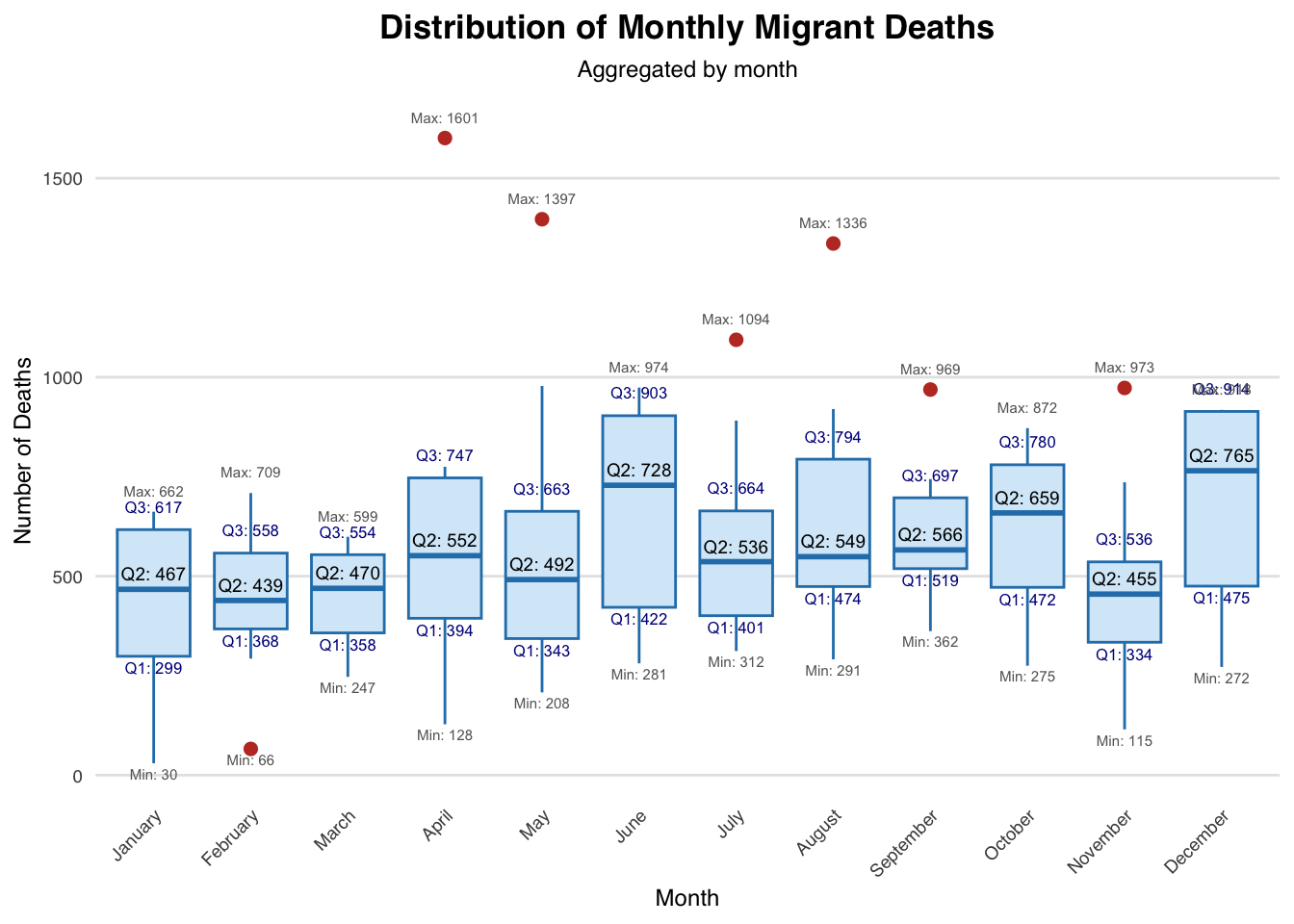
Q2 How have migrant deaths changed over the years?
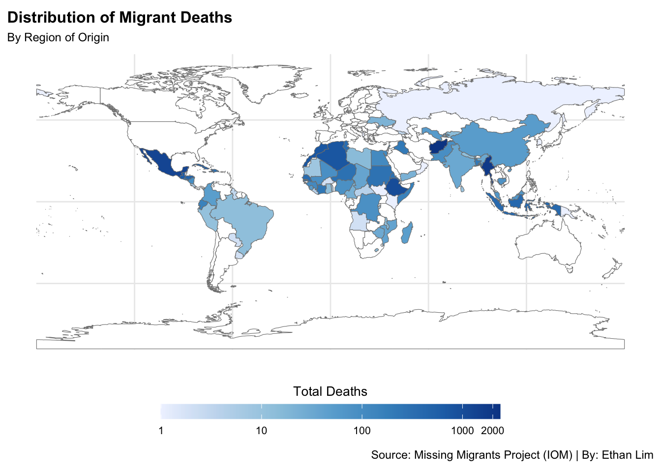
# Step 1: Define Region Groupsdf_region <- df_cleaned |>mutate(# Create a broad Region Group to cluster similar regions together`Region Group`=case_when( region_of_incident %in%c("North America", "Central America", "South America", "Caribbean") ~"Americas", region_of_incident %in%c("Eastern Asia", "Central Asia", "Western Asia", "Southern Asia", "South-eastern Asia") ~"Asia", region_of_incident %in%c("Northern Africa", "Southern Africa", "Western Africa", "Eastern Africa", "Middle Africa") ~"Africa", region_of_incident %in%c("Europe", "Mediterranean") ~"Europe & Mediterranean",TRUE~"Other"),# Create a detailed label combining Region Group and specific Region`Region Label`=paste(`Region Group`, "-", region_of_incident))# Step 2: Define a Clear Color Palette for Region Groupsregion_colors <-c("Africa - Northern Africa"="#a1d99b","Africa - Southern Africa"="#74c476","Africa - Western Africa"="#41ab5d","Africa - Eastern Africa"="#238b45","Africa - Middle Africa"="#005a32","Americas - North America"="#fdae6b","Americas - Central America"="#fd8d3c","Americas - South America"="#e6550d","Americas - Caribbean"="#a63603","Asia - Eastern Asia"="#cbc9e2","Asia - Central Asia"="#9e9ac8","Asia - Western Asia"="#756bb1","Asia - Southern Asia"="#54278f","Asia - South-eastern Asia"="#3f007d","Europe & Mediterranean - Europe"="#fbb4b9","Europe & Mediterranean - Mediterranean"="#f768a1","Other - Other"="grey60")# Step 3: Group and Plot with facet_wrap()library(plotly)
Attaching package: 'plotly'
The following object is masked from 'package:ggplot2':

    last_plot
The following object is masked from 'package:stats':

    filter
The following object is masked from 'package:graphics':

    layout
Warning: Using `size` aesthetic for lines was deprecated in ggplot2 3.4.0.
ℹ Please use `linewidth` instead.
# Step 4: Make plot interactivep1 <-ggplotly(p1, tooltip ="text")# Step 5: Save interactive plot as HTMLinstall.packages("htmlwidgets")
The following package(s) will be installed:
- htmlwidgets [1.6.4]
These packages will be installed into "~/Desktop/(-S-)/HKU/Year1/Year1_Sem2/JMSC/JMSC1003/Final Project/ethan-website/renv/library/macos/R-4.4/aarch64-apple-darwin20".

# Installing packages --------------------------------------------------------
- Installing htmlwidgets ...                    OK [linked from cache]
Successfully installed 1 package in 4.4 milliseconds.
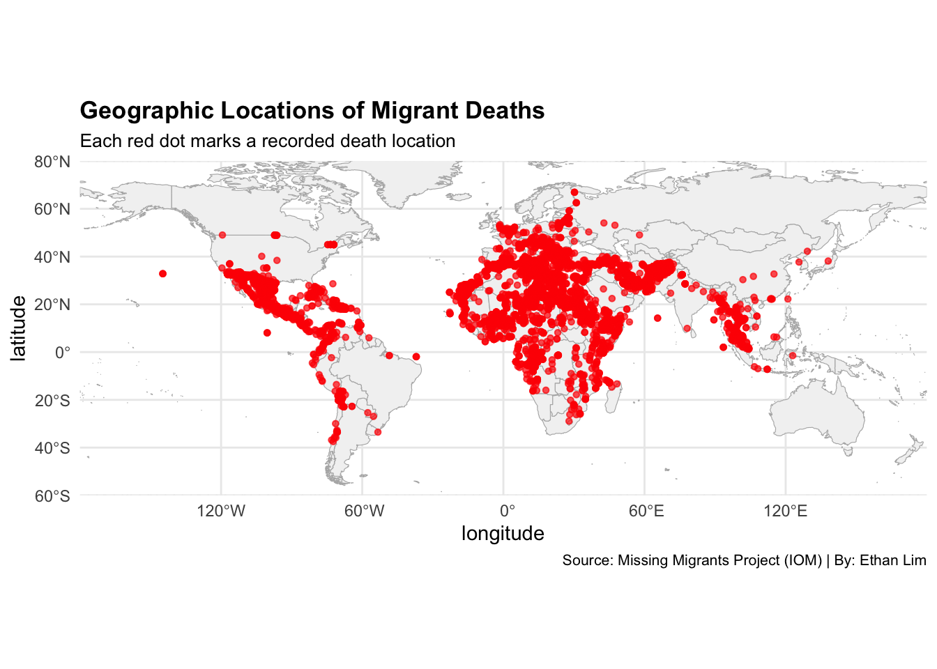
Q5 Where are migrant deaths geographically concentrated?
# Step 1: Install & Load packagesinstall.packages("rnaturalearth") # For country shapefiles
The following package(s) will be installed:
- rnaturalearth [1.0.1]
These packages will be installed into "~/Desktop/(-S-)/HKU/Year1/Year1_Sem2/JMSC/JMSC1003/Final Project/ethan-website/renv/library/macos/R-4.4/aarch64-apple-darwin20".

# Installing packages --------------------------------------------------------
- Installing rnaturalearth ...                  OK [linked from cache]
Successfully installed 1 package in 3.1 milliseconds.
install.packages("rnaturalearthdata") # Dependency for rnaturalearth
The following package(s) will be installed:
- rnaturalearthdata [1.0.0]
These packages will be installed into "~/Desktop/(-S-)/HKU/Year1/Year1_Sem2/JMSC/JMSC1003/Final Project/ethan-website/renv/library/macos/R-4.4/aarch64-apple-darwin20".

# Installing packages --------------------------------------------------------
- Installing rnaturalearthdata ...              OK [linked from cache]
Successfully installed 1 package in 2.9 milliseconds.
library(rnaturalearth)# Step 2: Extract latitude and longitude from 'coordinates'df_cleaned <- df_cleaned |>separate(coordinates, into =c("latitude", "longitude"), sep =",", remove =FALSE) |>mutate(latitude =as.numeric(trimws(latitude)),longitude =as.numeric(trimws(longitude)) )# Step 3: Filter valid points (non-missing coordinates and deaths > 0)df_points <- df_cleaned |>filter(!is.na(latitude), !is.na(longitude), total_death_missing >0)# Step 4: Load world mapworld <-ne_countries(scale ="medium", returnclass ="sf")# Step 5: Plot mapmap0 <-ggplot() +geom_sf(data = world, fill ="gray95", color ="gray70", size =0.2) +geom_point(data = df_points,aes(x = longitude, y = latitude),color ="red",fill ="white",size =1.2,alpha =0.7 ) +labs(title ="Geographic Locations of Migrant Deaths",subtitle ="Each red dot marks a recorded death location",caption ="Source: Missing Migrants Project (IOM) | By: Ethan Lim" ) +coord_sf(xlim =c(-180, 180), ylim =c(-60, 80), expand =FALSE) +theme_minimal() +theme(plot.title =element_text(size =13, face ="bold"),plot.subtitle =element_text(size =10),plot.caption =element_text(size =8),legend.position ="none",panel.background =element_rect(fill ="white", color =NA),plot.background =element_rect(fill ="white", color =NA) )# Step 5: Save the map as PNG fileggsave(filename ="vs/Q6.png", plot = map0, width =10, height =6, dpi =300)map0
Q6 How do migrant deaths vary by region of origin?
# Step 1: Install & Load packagesinstall.packages("RColorBrewer") # For color palettes
The following package(s) will be installed:
- RColorBrewer [1.1-3]
These packages will be installed into "~/Desktop/(-S-)/HKU/Year1/Year1_Sem2/JMSC/JMSC1003/Final Project/ethan-website/renv/library/macos/R-4.4/aarch64-apple-darwin20".

# Installing packages --------------------------------------------------------
- Installing RColorBrewer ...                   OK [linked from cache]
Successfully installed 1 package in 3.3 milliseconds.
library(RColorBrewer)# Step 2: Summarize deaths by country of origindf_country <- df_cleaned|>filter(country_of_origin !="Unknown", !is.na(country_of_origin))|>group_by(country_of_origin)|>summarise(total =sum(total_death_missing))# Step 3: Load World Mapworld_map <-ne_countries(scale ="medium", returnclass ="sf")|>select(name_long, geometry)# Step 4: Merge deaths to map by country nameworld_map_deaths <- world_map|>left_join(df_country, by =c("name_long"="country_of_origin"))# Step 5: Plot mapmap1 <-ggplot(world_map_deaths) +geom_sf(aes(fill = total), color ="gray50", size =0.1) +scale_fill_distiller(palette ="Blues",na.value ="white", trans ="log", direction =1,name ="Total Deaths",breaks =c(1,10,100,1000,2000),guide =guide_colorbar(barwidth =18, barheight =0.8, title.position ="top", title.hjust =0.5)) +labs(title ="Distribution of Migrant Deaths",subtitle ="By Region of Origin",caption ="Source: Missing Migrants Project (IOM) | By: Ethan Lim" ) +theme_minimal() +theme(plot.title =element_text(size =12, face ="bold"),plot.subtitle =element_text(size =9),legend.position ="bottom",legend.title =element_text(size =10),legend.text =element_text(size =8))# Step 6: Save the map as a PNG fileggsave(filename ="vs/Q5.png", plot = map1, width =10, height =6, dpi =300)map1